The goal was to attract shoppers’ attention to a new brand in an engaging and fresh way that remains consistent with the brand’s identity.
- Client: STOCK Plzeň-Božkov s. r. o.
- Materials: Cardboard, Kapa board, LED panel, LED strips
- Usage: In-store placement in main aisles (Shop-in-Shop and palette displays) and within the category’s home shelf (Hot-point).
- Realization: 2024
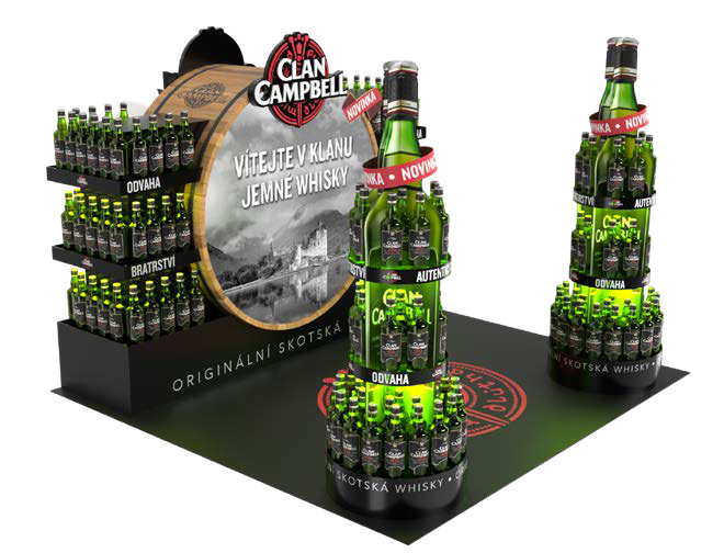
Project Description
Our objective was to invite shoppers to discover the smooth taste specific to Clan Campbell. Through visual storytelling, we transported customers into the world of Scotch whisky, utilizing the brand’s primary symbols: the signature green color, the bottle silhouette, the red emblem, and the logo.
Visual Impact and Symbols
To command attention on the retail floor, we incorporated iconic category symbols and modern lighting elements:
Consistency: The combination of traditional imagery and bold LED elements creates a “stop-and-hold” effect, effectively introducing the new brand to the market.
Thematic Elements: The inclusion of a wooden barrel design instantly communicates the whisky category’s heritage.
Lighting Effects: We utilized a prominent light box integrated into the barrel and bottle-shaped stands to ensure high visibility.